When I go to play Football, I carry a Football

It’s a no-brainer that when you want to play Football, or have to play Football, you carry a Football. But then you Gym bag is needed to carry the ball and a few other things like the Spike Boots, well you cant really drive with those on and so on.

But what if you want to play football and your Gym bag was big and already carried a Basketball, a Hockey Stick, a Baseball Bat, a Cricket Bat, a Tennis Racquet etc. Would you still carry all of them to the Football field? My guess is not, you would locate a smaller bag.

At this point, some may argue that softwares are like tools and not balls, but even then, I rarely see someone putting the Soldering Iron with their Wrench in the same box.

And that’s exactly the problem with too many internet based services getting clubbed and combined together. When I want to mail, I just want to mail. When I want to edit my documents, I just want to do that. When I want to speak to someone, I just would like to do that. These are options that should be separate, not because it’s easier to have them like that, but it’s human to have them like that.

However, there are many internet based services that are trying to combine all this on to a single webpage and calling it a dashboard. It’s good, but as long as that shows only the highlights and details are well segregated. What they need to list down are the services that Need to be separate and The services that are auxiliary like chat, tweet, global positioning etc. If it’s not done that way, your user may soon find his Football and Wall Street buddies on the same dining table. Sure there can be overlaps, but not a complete one, and it can be a disaster.

What would work?

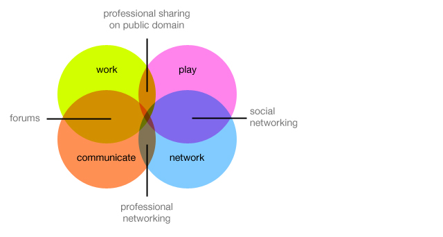
  1. Segregate the Work and Play software (Linkedin and Facebook)
  2. Segregate Productive and Communication software (Google Docs and Gmail)
  3. Segregate services like Photos and Videos (Like Youtube and Flickr)
  4. Bind all these with Social and Professional Networking software (Google chat riding within Gmail)

Google Buzz!!

Why again?

It was supposed to get me updates from Picassa, Blogger, Flickr, and some more things. But initial experience soon became a pain of repeated comments and updates. Simple things are not sorted out. Things like sending me an update on my own comment. These kind of things just highlight the fact that the product or service has been thrown out in a hurry.

Then there are status messages. Which are pretty much like tweets and they appear in your inbox. Personally, I would like to keep status updates separate from emails, they are really not the same things. But it does not end here.

When you comment on a status message, the complete chain of messages as a single email update is mailed to you. It’s cute when there are 5 comments, and plain irritating if there are more than 30.

Have a few questions for Google

1. What’s the need of getting into social networking when there are quite a few of them that already work well. Why not collaborate and improve upon it.

2. Why not innovate and improve upon instead of barging in suddenly. Gmail is simply popular for its efficiency. Gmail is yet not perfect and still has a lot of scope for improvement.

3. Why so many products? We all thought Docs was a great idea. But it seems thats not getting any better any soon.

“We did not enter the search business, They entered the phone business. Make no mistake: they want to kill the iPhone. We won’t let them.”

- Steve Jobs, iPad Launch

And many of us completely agree with Jobs here. It’s almost like there are people in Google sitting and waiting for new products to come out which then they can “Improve” upon.

Make a product that’s needed, if it makes people go “Wow!” on day one, that’s a plus. Probably Buzz is a good product, but the premature launch of a buggy product just killed it.

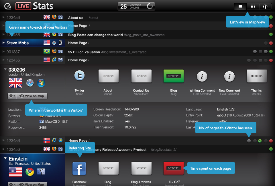
LiveStats by GoSquared – Real-Time Traffic Monitoring for your Site

LiveStats by GoSquared – Real-Time Traffic Monitoring for your Site.

Livestats

Livestats

The software gets you live information on who is visiting your website at any given time. But what’s stunning is the User Interface that does the job. Even though I have no utility for this kind of a software, I am tempted.

The product gives detailed information about the visitors, their IPs, the country they are from including a small flag, what operating system and which browser they are using also in visual form, how much time they are spending on which page and much more. All this in a delicious visual format making the boring thing of Site Stats so much more interesting.

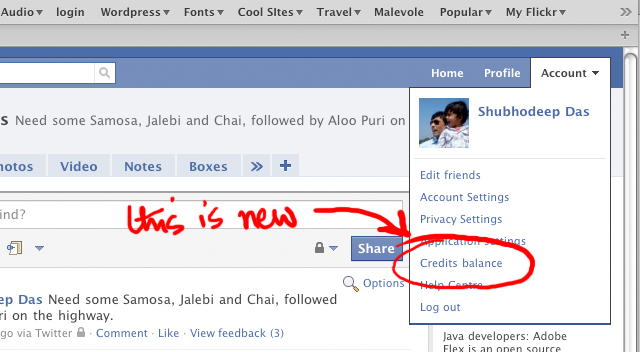
Facebook – Credit Balance – This is new!!

Credits Balance on Face/book

Credits Balance on Face/book

Was just going through the new new new Facebook User Interface and I noticed this. Seems like Facebook wants to get serious this time around in making money.

Clear monetization of existing services. Let's see how that goes.

Clear monetization of existing services. Let’s see how that goes.

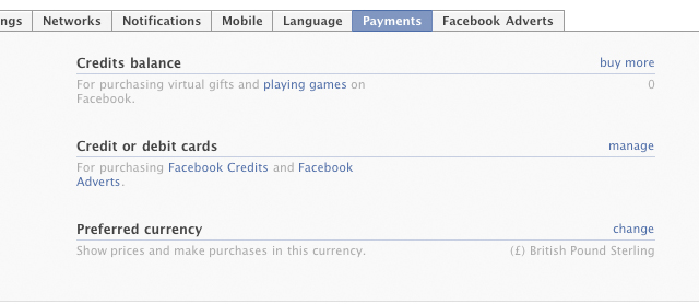
And inside it has these options. (Shown in second image)

Styling a Button in CSS

This post is for those who are not into CSS and HTML and normally get stuck trying to style their buttons

Every day on almost every website we come across these lovely buttons and on some we get the plain old boring default ones. We are not concerned with the boring ones, but here’s a small tip (which most web guys would know already) to style your ‘Buttons’ on your web page easily.

Lets say we want to create this.

This type of a Button is made of Two Components. The Text part, “Unsubscribe” and the image part.

But that’s not all you need as a background image. What you need is a background image that has the image for all the button states, namely, hover, active, regular, and disabled (if needed). So you need to start with an image which looks like this.

Now we get to the CSS part. Select a “classname” for your button that you want to style. Lets say it’s “funkybutton”. For that our base CSS for the button would go like this.

<style>input.funkybutton {
background-image: url(css/submit.gif);
background-repeat: no-repeat;
width: 115px;
height: 25px;
background-color: white;
border: none;
color: white;
padding-top: 1px; /* this is specifically for text alignment. adjust for your font-size and font*/ }
</style>

And an HTML part for this

<input name="submit" type="submit" id="submit-<?php the_ID(); ?>" tabindex="5" value="Submit Comment"/>

And this together should give you this button:

But we are not done yet. Now we need the rest of the states for the same button to be covered, and that’s done line this in the stylesheet.

<style>
input.funkybutton {
background-image: url(css/submit.gif);
background-repeat: no-repeat;
width: 115px;
height: 25px;
background-color: white;
border: none;
color: white;
padding-top: 1px; /* this is specifically for text alignment. adjust for your font-size and font*/ }

input.submit:hover {
background-position: 0 -25px;
}

input.submit:active {
background-position: 0 -50px;
}

</style>

Giving you a fully functional button like this:

Give it a try. (This same button is user everywhere in this theme as well)

Notion Ink’s Adam

Notion Ink Adam hands-on via Notion Ink Adam hands-on – SlashGear.

Here’s another Tablet in the market, hitting it a wee bit before the iPad, sometime in December 2008.

Since it’s a prototype the Adam’s casing here is not what the final design will be; in fact this was hand-made especially for showing the tablet at CES. The eventual hardware will be 14mm thick (Rohan said they could even get it down to around 12mm) with a reasonably minimal bezel, packed with the 10.1-inch Pixel Qi transflective display, a capacitive touchscreen eventually capable of recognizing six simultaneous points of contact, integrated WiFi and 3G. Thanks to Tegra 2 the Adam is 1080p capable, with an HDMI port to output to an HDTV or projector, and while the OS they’re showing today is bare Android they’ve a new UI in the works complete with a replacement on-screen keyboard more ergonomically designed for large-touchscreen use.

- Slashgear

Notion Ink, Adam. Image courtesy - Slashgear

Notion Ink, Adam. Image courtesy – Slashgear

Read the rest here. Notion Ink Adam hands-on via Notion Ink Adam hands-on – SlashGear. Notion Ink is based out of Hyderabad and the product design is carried our by Ether Design very much in Bangalore.

Getting inline comments on any WordPress Theme Homepage

Just like this Blog’s homepage. The steps are easy. Here is a small description into how I got this done on this blog. Why I got this done is explained first. Over the years I have shied away from commenting on Blogs simply because one has to click and go to a comments popup form or a post page, not that works just fine on larger posts where there are tons of stuff to read, tons of Maps and Images and other stuff to go through, but for a very simple day to day blogging, that kind of comes across as a lose nut in the theme, and that’s how I got around to get this done.

Here’s how.

Step 1. Open you index.php file in the theme and locate the loop. That should look like this. It should start with the following:

<?php if (have_posts()) : while (have_posts()) : the_post(); ?>

And end with the following:

<?php endwhile; ?>
....
<?php endif; ?>

Between these two parts is where your posts pop up and the whole thing is repeated over and over again depending on the amount of posts you would want to load up on the homepage, which can be set right there in the settings. We don’t want to touch that.

Step 2: Now open your single.php file and find this small piece of code.

<?php comments_template(); ?>

Change that to:

<?php $withcomments = "1"; comments_template();?>

Copy that and paste it right above the end of the loop, just before this:

<?php endwhile; ?>
....
<?php endif; ?>

This should result in the comments form and the comments to pop up right under each post. But that would also pop up a bunch of errors as each form field ID would get repeated over and over again, and that can’t be cool.

Step 3: Now open the comments.php file in your theme directory. In that you will have to locate each ID identifying each field in the comments form. Either prefix or suffix them with the following code to make them unique. The code pulls out the post ID and adds a suffix to the already existing ID after a hyphen. Here’s how:

<input type="text" name="author" id="author" value="<?php echo esc_attr($comment_author); ?>" size="40" tabindex="1" <?php if ($req) echo "aria-required='true'"; ?> />

Becomes:

<input type="text" name="author" id="author-<?php the_ID(); ?>" value="<?php echo esc_attr($comment_author); ?>" size="40" tabindex="1" <?php if ($req) echo "aria-required='true'"; ?> />

Note the:

-<?php the_ID(); ?>

added right after the “author” in the ID of the Input Field. Do this for all the fields and submit buttons. Once you are done, you are error free for most of the part. But there still remains one problem, now when the page loads, you will see all the comments form and that cant be good, it would look cluttered and bad.

Step 4: Add or Change the “Reply” button under the post, in most themes this button is linked to the post page.

Instead put this Hyperlink to the “Reply” button:

<a href="javascript:toggleLayer('respond-<?php the_ID(); ?>');">Reply</a>

By any luck, you would have already added the “Post ID” identifier to the “respond” ID in the comments.php. That leaves us with the Javascript. Copy the following code and place it within the <head> section of your header.php file.

<script type="text/javascript">function toggleLayer( whichLayer ) { var elem, vis; if( document.getElementById ) // this is the way the standards work elem = document.getElementById( whichLayer ); else if( document.all ) // this is the way old msie versions work elem = document.all[whichLayer]; else if( document.layers ) // this is the way nn4 works elem = document.layers[whichLayer]; vis = elem.style; // if the style.display value is blank we try to figure it out here if(vis.display=='' && elem.offsetWidth!=undefined&&elem.offsetHeight!=undefined) vis.display = (elem.offsetWidth!=0&&elem.offsetHeight!=0)?'block':'none'; vis.display = (vis.display==''||vis.display=='block')?'none':'block'; }</script>

Thats it. you are done. This Javascript will simply “Show/hide” your comments form identified by “respond-(postID)”. Now I am no PHP guru, but this seems to work just fine returning zero errors.

[Edit] If you are copying the codes from above in green. Make sure you copy them into Notepad / Textedit and remove all formatting (convert to plain text) before pasting them in.

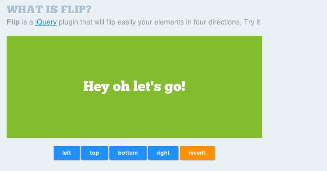
Flip! A jQuery plugin v0.9.9

Flip! A jQuery plugin v0.9.9.

Just came across this post while browsing for 3D Topic Browsers in Jquery. It’s a simple Jquery funcltion to flip a container within a web page. I think, it’s a great idea to have spot reply forms created with these. They will give a blog very ‘Dashboard – Widget – Settings’ kind of feel. Will give it a test drive soon.

Flip Box

Flip Box

Back to the Future – on a wall

This is a video of an anamorphic, time traveling DeLorean (Mr. Fusion and all) I made in my basement. The image was made using only painter’s tape and elbow grease.
And, it makes me happy every time I look at it.

- Wablamo (on youtube)

I think it’s pure fun. Even more fun if you are a DeLorean fan.

How safe are modern buses?

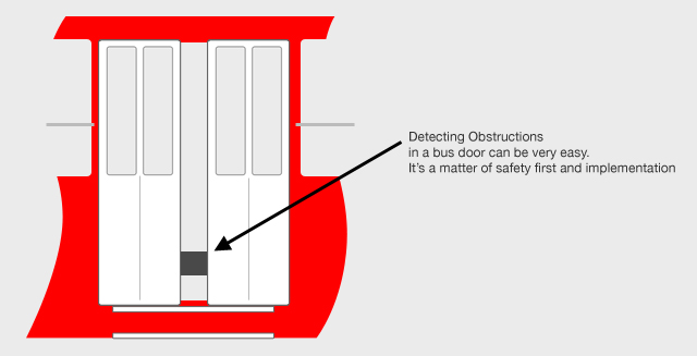
There have been recent cases of people getting stuck in bus doors and the bus moving off resulting in injury. It is true that the drivers and conductors of these buses care very little, and in the stressful traffic have little to spare to do that.

But can’t the manufacturer rig the doors correctly?

Metro in Calcutta started 2 decades back and the doors would open if something or someone got caught in them and they did not shut properly. Its alarming that such stuff is not in place on buses even today.

The tech part should be fairly simple.

  1. Detect an open door
  2. Disengage the already electronic / hydraulic clutch (yep, they are no longer wires pulling each other)
  3. Bus does not move.

Technology is there, it’s a matter of using it.

Auto Closing double jackknife bus door

What would You Prefer?

User interaction forms have been around on the web for a very very long time. And just like software on desktop, each operational item is displayed either by and Icon or a Button or Both.

Screengrabs from skype.com. panic.com and cleartrip.com

[poll id="3"]

Users, Websites and Bots

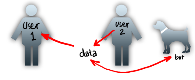
Back in the late 90s most websites were made for the user. And they are so even now. But the definition of the user has changed over time and become complicated. The concept initially was much like a software, “a person comes and uses a website” and has changed over time to “a person comes and accesses information”. That soon brought in the text torrent of “user”, the one’s that are putting the data in. And it soon became a balance and a matter of priority.

This is just a broad overview.

Social networking sites as we see today consider the later to be their primary user. Sites like google, amazon etc consider the former to be their primary user.

The idea has to slowly shift to combine the both, to invite the “accessing” user to “provide” more often, and this can be done only when the “process of providing” becomes a lot easier.

Apart from that, now we have to keep in mind the 3rd kind of user. “The Bots”, or crawlers from various search engines. Yes, a site has to be easier to crawl for information as well, and easier it is to do that, the better chances of it’s visibility on various search rankings.

What’s next?

The move should be to design for the 2 types of users and try and merge them. This would lead to a steady flow of updated information (not just about status messages and tweets but relevant information). The move has already started, and personal computing devices and slowly changing sizes and shape to aid in the process. And designs have to mirror the same sentiments.

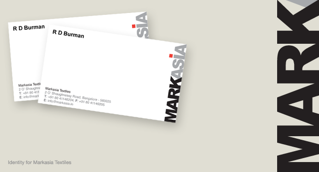
Markasia – Identity

Identity design for Markasia Textiles. A recently worked upon project. Will post more details with other images later in the work section.

Markasia Business Cards

Most used browser

I am surprised to see this. Analytics running on the Blog say that Safari and Firefox are the most used browsers ahead of an unknown which I presume is Google Chrome. IE is a distant 4th.

Browser data

Why Apple leaves out Car Audio?

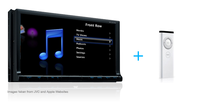
This is not a rumor or a hoax, this is just a suggestion.

We all know that iPod is probably one of the most used devices in the car in conjunction with other devices that already exist. But why doesn’t apple get into the market directly and give us front row right from the driver’s seat either as a Software (with 3rd part hardware) or Hardware + Software combo. Many die hard fans have already put their Mac Minis in the their cars.

Car audio running front row!


[poll id="2"]

Most Innovative Spam

“I don’t know if i totally agree with that. But nevertheless, you make a good point. What if I can come up with a response in opposition to your arguments”

Yep. That’s a spam caught in Akismet. On a regular blog that may sound like a legit comment, but when its posted on a tweet that criticizes .aspx pages and from a Light Bulb company. It’s a Spam. Good try.