Should the Designer Write Code?

Yes

The designer should write the primary code and test his / her theories in interactions by doing so, much like a prototype. It’s even better if you can create prototypes that can work just as well in production. Without this, much of the Design is of no use as you are always at the mercy of the person writing the CSS and HTML and their skill set. Writing your own HTML, CSS, some part of Javascript and PHP never hurts, that’s what makes things work exactly how you wanted them to be. A good place to start practicing your skills is a dummy install of a wordpress blog and then changing it one step at a time using the theme editor.

Should one use a visual editor

No. They are mostly for people that don’t want to do the hard work and create a lot of junk code. Avoid editors like dreamweaver where things can be dragged and dropped. Best way to do it is using Notepad (Windows) and TextEdit (Mac) and a bunch of stuff that are free on Linux. If you want it to be a bit more colourful you can use editors like Coda, Netbeans or Sublime Text. They help you just a bit by colour coding the different aspects of the code.

When do I use Photoshop?

Only when you need to create graphical elements that are not possible through CSS3 and HTML5

Translating to Tablet

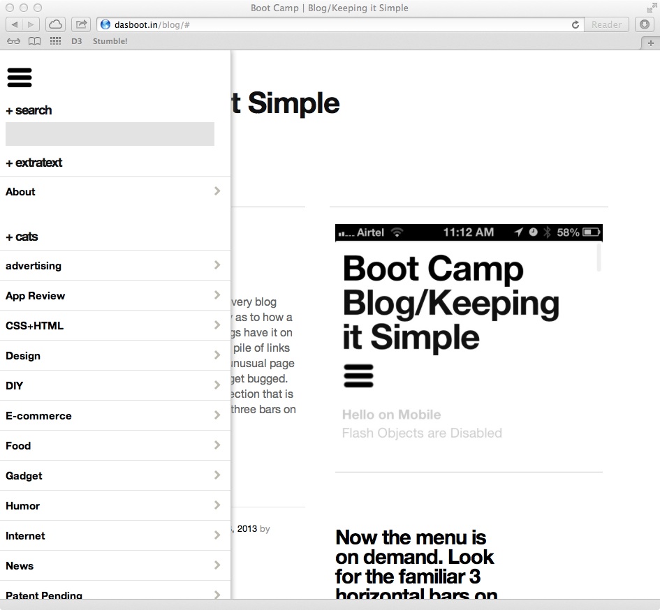
Translating to tablet is a tough job with so many of them around in various resolutions. I dont have enough metrics yet to decide from which point to switch to a Tablet View and after that to a Mobile view. But overall, the experience should be similar to available apps, like Mail, Facebook, and others which users are already used to. Here’s a view of that this page looks like with the menu tab open on an iPad.

Clicking on the 3 bars under the header opens the side panel on iPad and other tablet devices below 980px maximum resolution

Clicking on the 3 bars under the header opens the side panel on iPad and other tablet devices below 980px maximum resolution

The geek stuff used to do this is 99% CSS and 1% JS. Just load up the required values with a proper media query that looks like this.

@media screen and (min-width: 641px) and (max-width: 980px) {
/* And put all the cool stuff here */
}

And then a simple open close for now using jQuery does the rest! You need to have two open / close buttons so that the user can actually close the panel if they do not need it. The status is not carried over to the new page that loads from any click.

$(document).ready(function(){
//$(".hidden-menu").hide(); this is to be kept on if you want the menu hidden always, even in full view
$(".show-menu").show();
$(".hide-menu").hide();
// this does the show menu part
$('.show-menu').click(function(){
$(".hidden-menu").slideToggle();
$(".hide-menu").show();
});
// this does the hide menu part
$('.hide-menu').click(function(){
$(".hidden-menu").slideToggle();
$(".show-menu").show();
});
});

That’s not all. Now you have to find the button and assign the class “showmenu” to it.

<div class=”menu-icon”><a class=”show-menu” href=”#”><img alt=”" src=”yourbuttonimage.png” /></a>

And then find the actual menu so that it knows what has to be opened when clicked! Make sure you create a separate class to define the attributes of the menu itself and not complicate matters by clubbing the two. It’s just simpler and easier

<div class="menu-class show-menu">/* Your menu here */</div>

Now that the menu is opening, chances are, it has hidden the button that was used to open it in the first place and there is no way to get rid of it if you wish to do so. For this, we add a simple fix, a clone button within the menu that does exactly the opposite. It closes the menu so that the user has a clear view to the actual content. You can give an additional conditional style to this one for situations where you do not need the button, for instance, mobile.

<div class="hidden-menu">
<div class="menu-icon hide-on-mobile"><a class="hide-menu" href="#"><img alt="" src="yourbuttonimage.png" /></a></div>
/* Your menu here */</div>

And we are all done!

Having an all accessible “Menu”

WordPress has it famous sidebar. And every blog needs one. It’s another thing completely as to how a theme interprets and shows it. Most blogs have it on the right of the left, like a standard large pile of links that keeps increasing. This leads to an unusual page height and people accessing your blog get bugged. This blog however will slowly go in a direction that is a hybrid of Desktop and Mobile and the three bars on top is the first step in that direction.

menu

Try it out

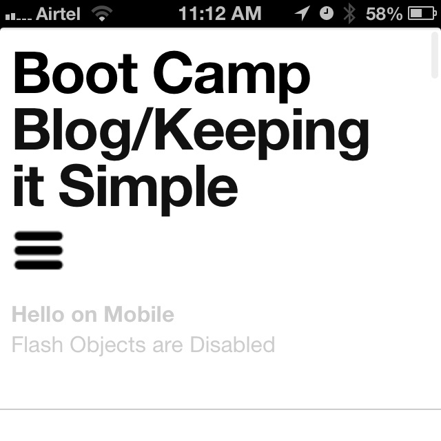
Now the menu is on demand. Look for the familiar 3 horizontal bars on mobile and tablet!

20130303-111413.jpg

Going Responsive – ReaderBlocks

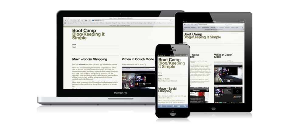
After a long time I have touched the Blog. Partly due to lack of time, partly due to patchy hosting service, more due to general laziness. Finally got around to creating the version 1.0 of my first responsive theme. Made for browsers across phones, tablets, laptops and desktops. This is still an “alpha” and I hope to fix most of the stuff and have the variations for this theme available for Download soon!

The current theme is in two columns / single column layout depending on the device or window width with selective formatting for specific categories. At least that’s the overall plan, lets see where it goes from here.

Current version of ReaderBlocks Beta

Current version of ReaderBlocks Beta

Styling a Button in CSS

This post is for those who are not into CSS and HTML and normally get stuck trying to style their buttons

Every day on almost every website we come across these lovely buttons and on some we get the plain old boring default ones. We are not concerned with the boring ones, but here’s a small tip (which most web guys would know already) to style your ‘Buttons’ on your web page easily.

Lets say we want to create this.

This type of a Button is made of Two Components. The Text part, “Unsubscribe” and the image part.

But that’s not all you need as a background image. What you need is a background image that has the image for all the button states, namely, hover, active, regular, and disabled (if needed). So you need to start with an image which looks like this.

Now we get to the CSS part. Select a “classname” for your button that you want to style. Lets say it’s “funkybutton”. For that our base CSS for the button would go like this.

<style>input.funkybutton {
background-image: url(css/submit.gif);
background-repeat: no-repeat;
width: 115px;
height: 25px;
background-color: white;
border: none;
color: white;
padding-top: 1px; /* this is specifically for text alignment. adjust for your font-size and font*/ }
</style>

And an HTML part for this

<input name="submit" type="submit" id="submit-<?php the_ID(); ?>" tabindex="5" value="Submit Comment"/>

And this together should give you this button:

But we are not done yet. Now we need the rest of the states for the same button to be covered, and that’s done line this in the stylesheet.

<style>
input.funkybutton {
background-image: url(css/submit.gif);
background-repeat: no-repeat;
width: 115px;
height: 25px;
background-color: white;
border: none;
color: white;
padding-top: 1px; /* this is specifically for text alignment. adjust for your font-size and font*/ }

input.submit:hover {
background-position: 0 -25px;
}

input.submit:active {
background-position: 0 -50px;
}

</style>

Giving you a fully functional button like this:

Give it a try. (This same button is user everywhere in this theme as well)