Google’s new image search

A few months back google switched from their old Image search to a new one where the preview is shown within the search results by opening up a box. It’s a Content First move from google and it works really well. To begin with:

  1. It allows the user to stay on the same page and see the results in a larger format / size
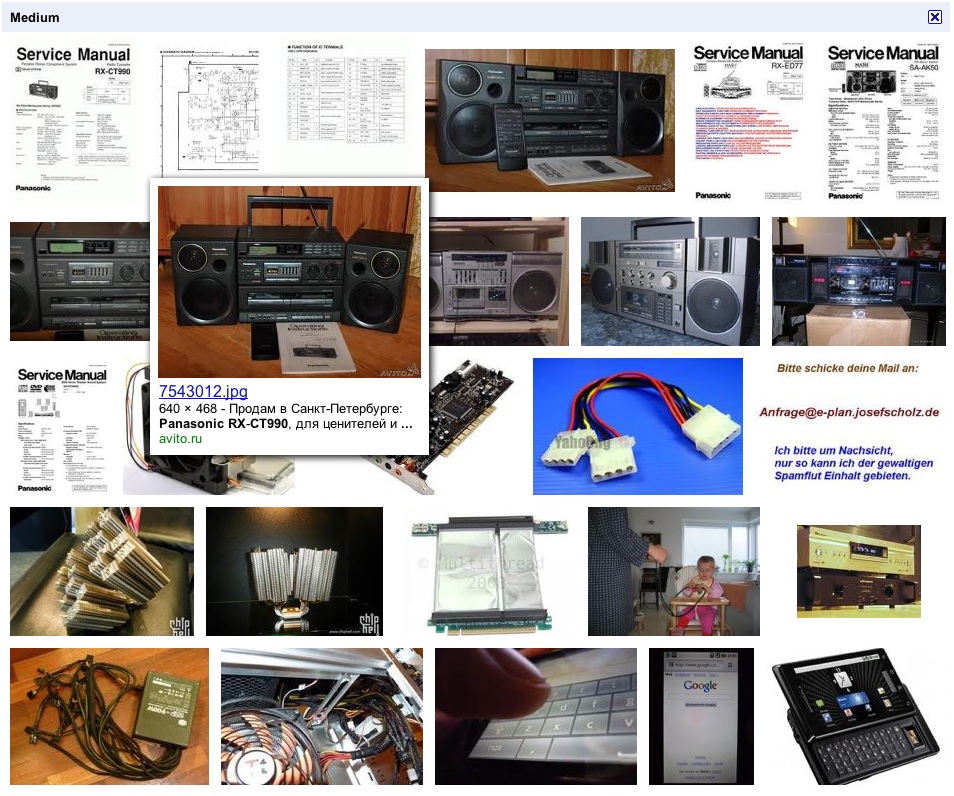
  2. Shows small thumbnails of the related images and strips the description that surrounds them
  3. Gives a clear buttoned approach to view the web page, the full resolution image or image details
  4. Image detail page actually gives further options to search the same image by size, look for similar images and snippets of the content associated with the images

On the annoying side, being creatures of habit, one will find constantly hitting the back button during preview and the page roll back in history loosing the search results, I guess it’s an easy fix that will get rolled in later or the users will get used to this mode and use the mouse more often than the keyboard.

Google's new Image Search with in page previews

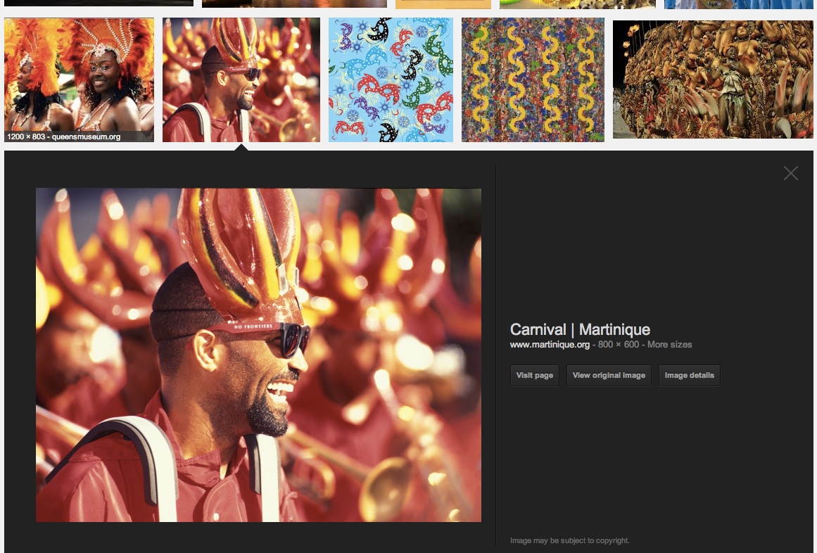
Google’s new Image Search with in page previews

Usable Data / Lots of Data

Often its is said that Google creates the most usable of Apps and I constantly try to find a reason behind it. A simple display on of information on their Maps App on iPhone (or Android, since I use both) presents the user with a lot of Data. A restaurants name and address and phone number for instance. But from here on its all downhill, the Map app just allows you to see that information, but if you have to make a call to that number, you better get ready with your Notes App to write it down or memorise it and then type it back in where its needed.

The right way to do it on a Phone App is to just give a Call Button that takes the phone number and dials it. General assumption is, if there is a number displayed on my phone whether in email or any app, in all probability I would like to save it or dial it. The actual number really does not matter any more since we are not dealing with paper and pencil here.

googleVsZomato

Google’s new Image Search Screen

Google has recently redone the image search results screen. I must say its towards the betterment but it could still be a lot lot better. Overall, it does manage to prioritize the image part and secondary information about the image is then dished out when one hovers on it. See attached Screen Shot.

Google's new image search result display

Google’s new image search result display

Here’s what it fails to do though. While displaying odd sized images, it sort of leaves a lot of white space around them and you sort of don’t know exactly what’s the clickable area. An area demarkation to make the display more uniform with very light shade of “google grey” might work wonders.

Also, they need to decide on the redundancy between the top navigation and the one on the left.

Internet Advertising needs to wake up a bit more

It’s time keyword based advertising on the internet started getting more sensible than they presently are. Attached image shows a screenshot from a website listing “Skins” for Mac OSX and the advertising that popped up was related to actual skin related products and service.

The website deals with Shapeshifter Skins for Mac OSX, the advertisement deals in actual Skin products. Probably time internet advertising started differentiating both.

The website deals with Shapeshifter Skins for Mac OSX, the advertisement deals in actual Skin products. Probably time internet advertising started differentiating both.

http://interfacelift.com/themes-mac/index.php?sort=date&id=&page=2

(Actual Page)

Taking into account the fact that this type of advertising has been around for a while, and companies promoting them are well funded, in this case – Google, they should find a way to scan more of the keywords and then decide on the type of advertisement that get featured on these pages.

When I go to play Football, I carry a Football

It’s a no-brainer that when you want to play Football, or have to play Football, you carry a Football. But then you Gym bag is needed to carry the ball and a few other things like the Spike Boots, well you cant really drive with those on and so on.

But what if you want to play football and your Gym bag was big and already carried a Basketball, a Hockey Stick, a Baseball Bat, a Cricket Bat, a Tennis Racquet etc. Would you still carry all of them to the Football field? My guess is not, you would locate a smaller bag.

At this point, some may argue that softwares are like tools and not balls, but even then, I rarely see someone putting the Soldering Iron with their Wrench in the same box.

And that’s exactly the problem with too many internet based services getting clubbed and combined together. When I want to mail, I just want to mail. When I want to edit my documents, I just want to do that. When I want to speak to someone, I just would like to do that. These are options that should be separate, not because it’s easier to have them like that, but it’s human to have them like that.

However, there are many internet based services that are trying to combine all this on to a single webpage and calling it a dashboard. It’s good, but as long as that shows only the highlights and details are well segregated. What they need to list down are the services that Need to be separate and The services that are auxiliary like chat, tweet, global positioning etc. If it’s not done that way, your user may soon find his Football and Wall Street buddies on the same dining table. Sure there can be overlaps, but not a complete one, and it can be a disaster.

What would work?

  1. Segregate the Work and Play software (Linkedin and Facebook)
  2. Segregate Productive and Communication software (Google Docs and Gmail)
  3. Segregate services like Photos and Videos (Like Youtube and Flickr)
  4. Bind all these with Social and Professional Networking software (Google chat riding within Gmail)

Google Buzz!!

Why again?

It was supposed to get me updates from Picassa, Blogger, Flickr, and some more things. But initial experience soon became a pain of repeated comments and updates. Simple things are not sorted out. Things like sending me an update on my own comment. These kind of things just highlight the fact that the product or service has been thrown out in a hurry.

Then there are status messages. Which are pretty much like tweets and they appear in your inbox. Personally, I would like to keep status updates separate from emails, they are really not the same things. But it does not end here.

When you comment on a status message, the complete chain of messages as a single email update is mailed to you. It’s cute when there are 5 comments, and plain irritating if there are more than 30.

Have a few questions for Google

1. What’s the need of getting into social networking when there are quite a few of them that already work well. Why not collaborate and improve upon it.

2. Why not innovate and improve upon instead of barging in suddenly. Gmail is simply popular for its efficiency. Gmail is yet not perfect and still has a lot of scope for improvement.

3. Why so many products? We all thought Docs was a great idea. But it seems thats not getting any better any soon.

“We did not enter the search business, They entered the phone business. Make no mistake: they want to kill the iPhone. We won’t let them.”

- Steve Jobs, iPad Launch

And many of us completely agree with Jobs here. It’s almost like there are people in Google sitting and waiting for new products to come out which then they can “Improve” upon.

Make a product that’s needed, if it makes people go “Wow!” on day one, that’s a plus. Probably Buzz is a good product, but the premature launch of a buggy product just killed it.