What are you selling?

Are you selling what people are searching?

Or are you just pushing things. Most common thing in today’s e-commerce is that when a product is not available, we put a Big Large Block with a JS Scroller and fancy jQuery saying “People who saw this product also saw this”. But is it really what I want or it’s just some makeshift arrangement. This is not as random as it seems to be.

When women look for Shoes, they are based on a Type, Style and Colour. The colour part is very important here. As opposed to when men look for Shoes its mostly based on Purpose and Brand. This is a general observation of Shopping Behaviour around me.

Then why is it that we do not take in into account? Attached is an image from a Popular E Commerce website and a very nicely done but it works only when my search matches a category. If I had searched for Yellow Headphones the same logic does not apply!

It is probably time for products to be listed by Tags rather than Categories and then organising the tags in a more user friendly manner.

Flipkart's product suggestion widget for items that are out of stock

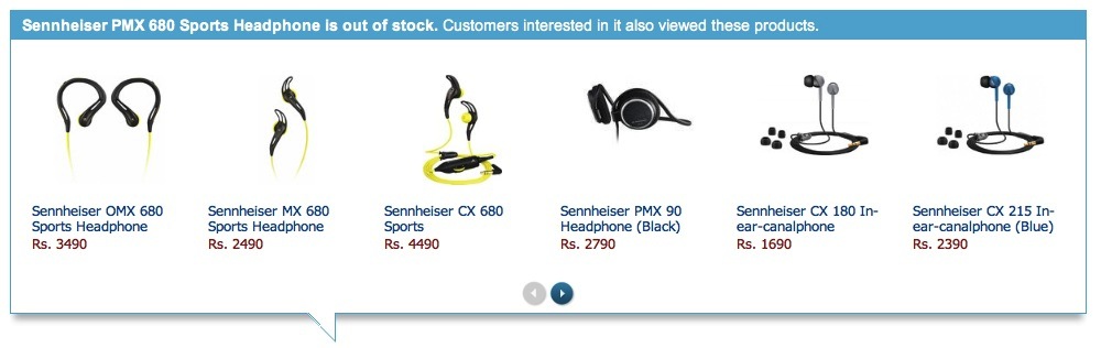
Flipkart’s product suggestion widget for items that are out of stock

Groceries are not exactly E Commerce

Post ZopNow many people have asked me why the website does not really adhere to the many basics of e commerce that we have come to expect over the last few years. The answer is simple, Groceries are not exactly E Commerce, in other words Retail. 

Let me put this in much more simpler words. Groceries are not really Benetton or Adidas. They are a repetitive purchase process, very boring and done in large quantities, often in numbers greater than 50 for one session. And this process is repeated more than once in a month, sometimes more than once in a week

This brings us to the next part of this kind of e-commerce, Speed. A customer should be able to add all these items at lightning speed so that this online experience results in lesser time consumption overall over the conventional method. And to bring in speed one has to get rid of some of the steps in regular retail.

A clip from a recent advertising campaign

A clip from a recent advertising campaign

Google’s new Image Search Screen

Google has recently redone the image search results screen. I must say its towards the betterment but it could still be a lot lot better. Overall, it does manage to prioritize the image part and secondary information about the image is then dished out when one hovers on it. See attached Screen Shot.

Google's new image search result display

Google’s new image search result display

Here’s what it fails to do though. While displaying odd sized images, it sort of leaves a lot of white space around them and you sort of don’t know exactly what’s the clickable area. An area demarkation to make the display more uniform with very light shade of “google grey” might work wonders.

Also, they need to decide on the redundancy between the top navigation and the one on the left.