Most probably it’s on your Browser
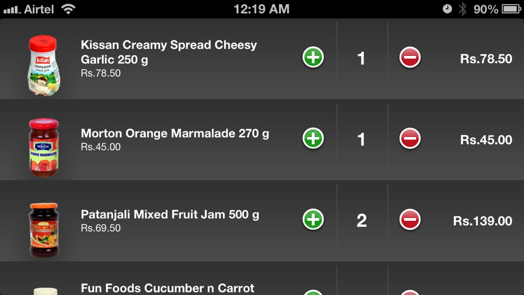
With so many e-commerce websites around us, one always wonders what is the correct place to put a shopping cart so that the user can easily access it. Most of these websites take the easiest route to execute by example and inspiration, in other words Copy Amazon and put it on the top right corner of their website. There is no problem with approach as long as it works, but it really does not work for everything. When a user is buying a book or a trouser, they probably have 2 to 3 items in their cart at the time of checkout. When they are buying groceries, they have 50 – 70 items in their cart of which almost all are repeat purchases. Putting the cart on the top right in this case just means a waste of available real estate on the screen and creating a very long scroll to actually see the cart. In truth, a regular user will never really look back on how many Scothbrites he put in the cart, and even if they do, it will be immediate within the next few minutes while adding the next few items. What is important is that they do not repeat a product, which means whatever goes into the cart gets marked as In Cart and preferably with a Count and an option to delete. This makes sure that if the user added 5 Scotchbrite Pads in the beginning of his session and forgets about it by the time he has added 50 more items, he can search for Scotchbrite and immediately see that its already in his Cart.
Then comes the Cart itself. Why not place it at the bottom or the top which is more scalable as the monitor size increases with an exclusive button to Edit Cart. While the horizontal band can keep showing the last 10 added items for immediate reconfirmation. It works, and increases the speed of shopping for the user significantly. It can be argued that users are not used to this placement, in truth, it’s an easier option and they soon get used to it. After all, the downloads in Google Chrome also show up at the bottom of the page, so does Chat Windows when you are on Gmail. So why not this!
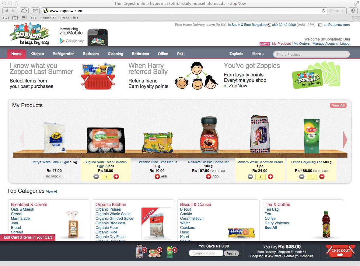
ZopNow with it’s shopping cart at the bottom of the page. Fixed.