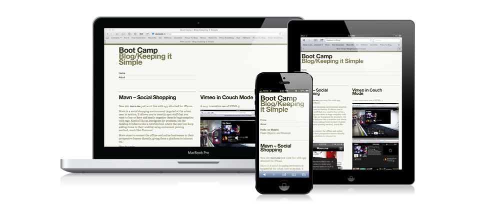
After a long time I have touched the Blog. Partly due to lack of time, partly due to patchy hosting service, more due to general laziness. Finally got around to creating the version 1.0 of my first responsive theme. Made for browsers across phones, tablets, laptops and desktops. This is still an “alpha” and I hope to fix most of the stuff and have the variations for this theme available for Download soon!
The current theme is in two columns / single column layout depending on the device or window width with selective formatting for specific categories. At least that’s the overall plan, lets see where it goes from here.

Current version of ReaderBlocks Beta
