
For years each of us have worked on user interfaces that interact in 1 dimension and with a maximum of 4 options. Left Click, Right Click, Centre Click and Scroll. And if you were stuck designing for a Mac then you just had Click and Scroll. Things changed rapidly with the first iPhone and the others that followed. With them came the world of multi-touch. Things rapidly changed from Click to Tap. Then came a whole lot of other gestures, Swipe Left, Right, Top, Bottom, while the Scroll was still around. Add to this Pinch and Zoom complicated further by 2 finger and 3 finger swipes Left, Right… and as if this was not all, there was Shake, Tilt and Gravity.
On todays date, most of these are not supported for HTML and JS, at least not without some serious effort. But on a Native App, you can really go crazy trying to decide which option to give. Apps like Snapseed, Magichour, have successfully managed to compress the complicated process of photo editing into a small 4″ screen (sometimes smaller) and yes, they work. The trick is to find out what comes naturally to the user on each device. Twitter’s retweet and share options hidden behind a swipe action was one of the first to exploit these features, and today almost everyone understands the process.
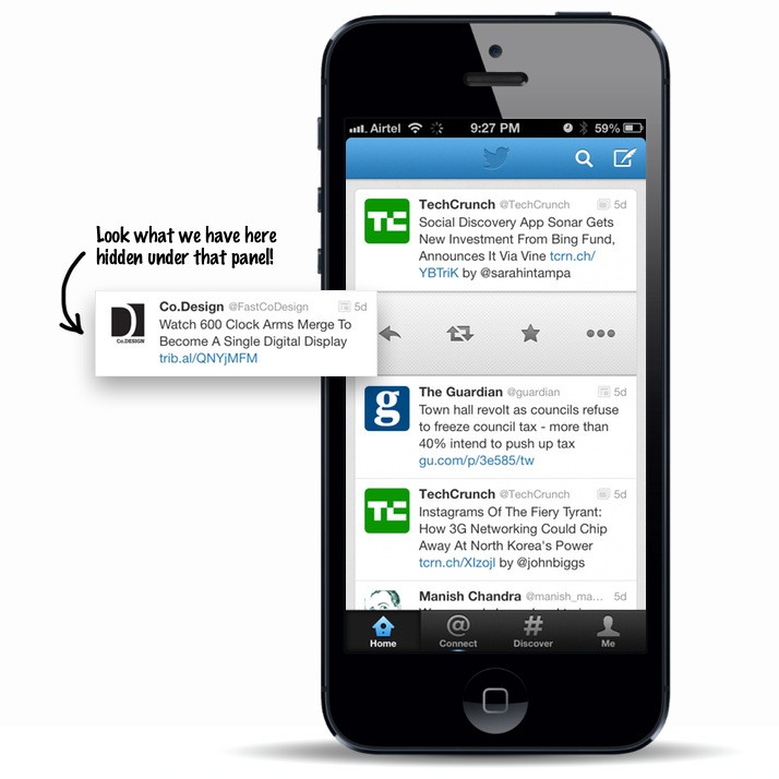
Twitter App was one of the first ones to take advantage of vertical scroll and horizontal swipe in the same view, now almost every app has this!
