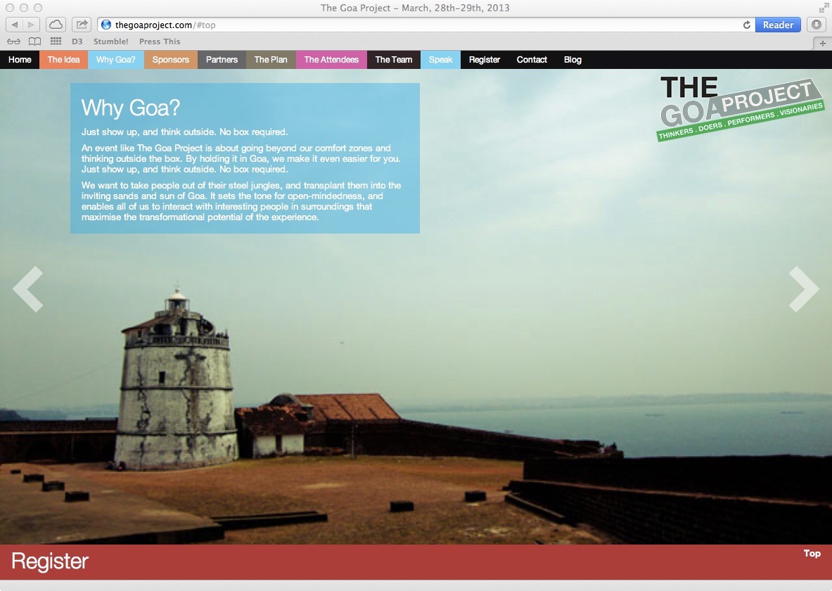
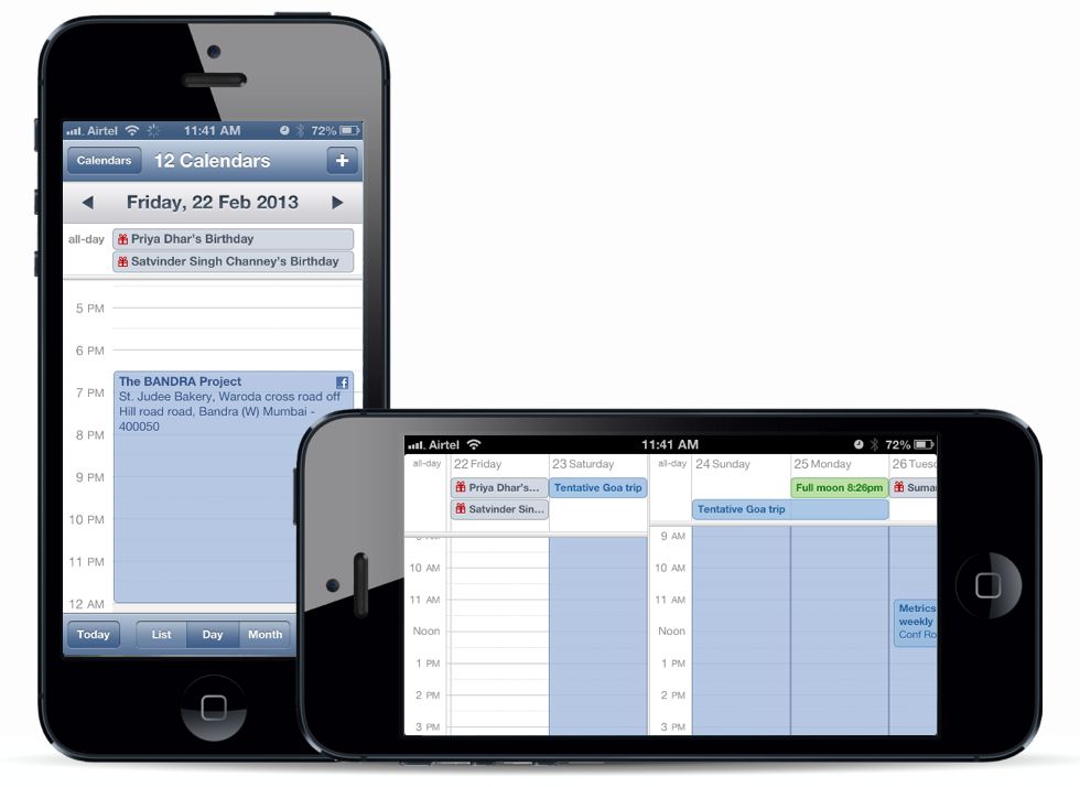
Translating to tablet is a tough job with so many of them around in various resolutions. I dont have enough metrics yet to decide from which point to switch to a Tablet View and after that to a Mobile view. But overall, the experience should be similar to available apps, like Mail, Facebook, and others which users are already used to. Here’s a view of that this page looks like with the menu tab open on an iPad.
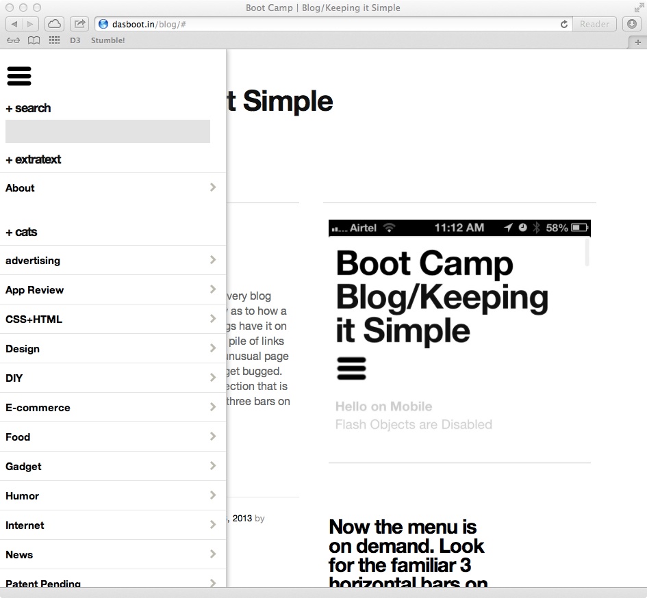
Clicking on the 3 bars under the header opens the side panel on iPad and other tablet devices below 980px maximum resolution
The geek stuff used to do this is 99% CSS and 1% JS. Just load up the required values with a proper media query that looks like this.
@media screen and (min-width: 641px) and (max-width: 980px) {

/* And put all the cool stuff here */

}
And then a simple open close for now using jQuery does the rest! You need to have two open / close buttons so that the user can actually close the panel if they do not need it. The status is not carried over to the new page that loads from any click.
$(document).ready(function(){

//$(".hidden-menu").hide(); this is to be kept on if you want the menu hidden always, even in full view

$(".show-menu").show();

$(".hide-menu").hide();

// this does the show menu part

$('.show-menu').click(function(){

$(".hidden-menu").slideToggle();

$(".hide-menu").show();

});

// this does the hide menu part

$('.hide-menu').click(function(){

$(".hidden-menu").slideToggle();

$(".show-menu").show();

});

});
That’s not all. Now you have to find the button and assign the class “showmenu” to it.
<div class=”menu-icon”><a class=”show-menu” href=”#”><img alt=”" src=”yourbuttonimage.png” /></a>
And then find the actual menu so that it knows what has to be opened when clicked! Make sure you create a separate class to define the attributes of the menu itself and not complicate matters by clubbing the two. It’s just simpler and easier
<div class="menu-class show-menu">/* Your menu here */</div>
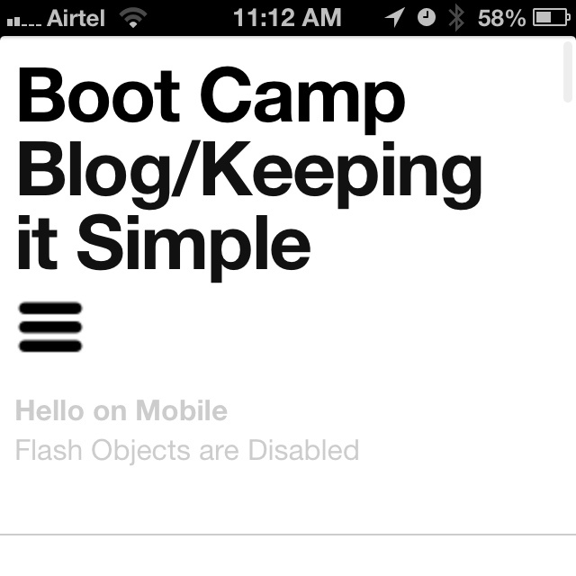
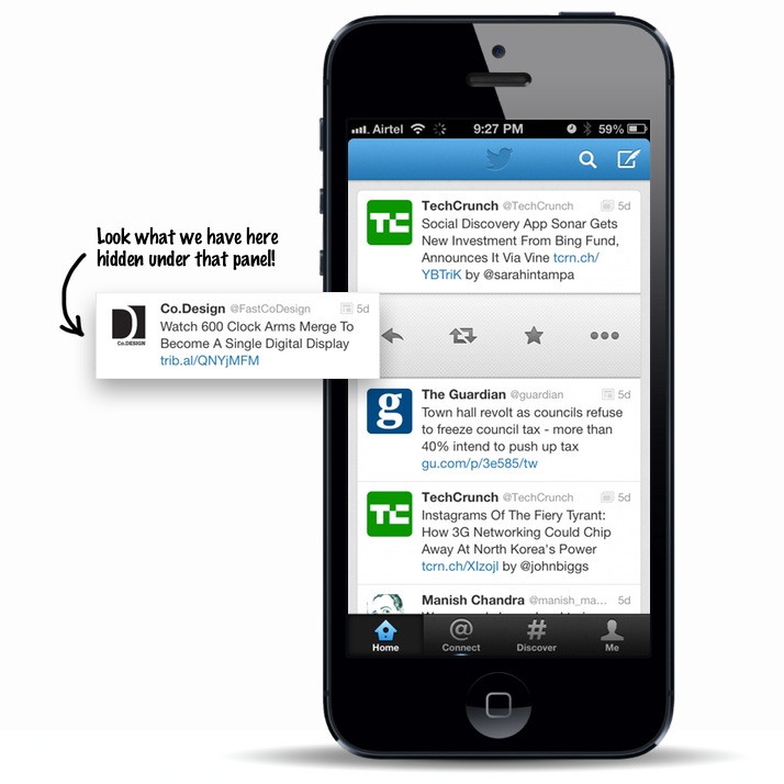
Now that the menu is opening, chances are, it has hidden the button that was used to open it in the first place and there is no way to get rid of it if you wish to do so. For this, we add a simple fix, a clone button within the menu that does exactly the opposite. It closes the menu so that the user has a clear view to the actual content. You can give an additional conditional style to this one for situations where you do not need the button, for instance, mobile.
<div class="hidden-menu">

<div class="menu-icon hide-on-mobile"><a class="hide-menu" href="#"><img alt="" src="yourbuttonimage.png" /></a></div>

/* Your menu here */</div>
And we are all done!

